Priorities App 2.0
Simply manage lists of prioritized items
The second iteration of the Priorities App pushes further the minimalistic UX design and adds a new feature: lists of lists. I presented the motivation behind the app and the design of the first version in a previous post. Priorities 2.0 is available for download on the App Store.
The home screen looks exactly the same as in the first iteration. The model is completely backward compatible, and users who do not need the lists of lists feature will not even be aware of it. This was a strong design requirement for 2.0.
 |
| Prioritized list |
The new feature is the ability to define inclusion relationships between any one item and any number of other existing items.
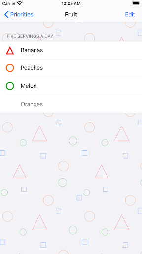 |
| Prioritized sublist |
From a user perspective, this mechanism provides a way to organize items hierarchically.
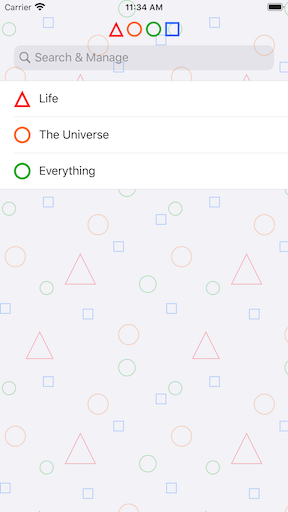 |
| Hierarchical organization |
Technically, it only amounts to a display/navigation convenience, as the underlying model is still a single master list of items. In practice an item can be a “subitem” of any existing item. This also means that the same item can appear in multiple other items.
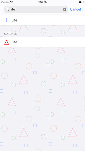
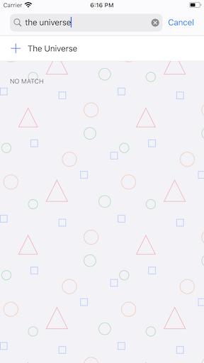
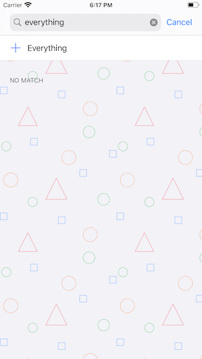
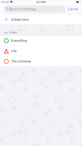
Search, add remove, create
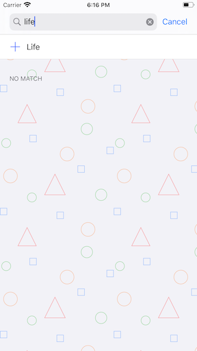
While there is still a “create” button displayed when searching for an item from the root list, this is only to preserve the user flow from the last version. The new streamlined model for adding items ties into searching:
When in search mode:
-
the first section lists all the matching sub-items in alphabetical order,
-
the next section lists all the existing matching items that are not currently subitems; each item has an action button to be added as sub-item,
-
the last section offers a “Create and Add Item” button automatically set to the search string
The suggested flow is for the user to look for the item they want to add, and create it if it does not exist yet. The creation is done in context, as the item is automatically registered as a sub-item of the list in which the user searched for it.

|
| Search and create |
Edit
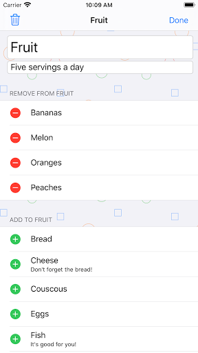
The item view offers an edit mode for the user to update the item’s name and description, and to manage the sub-items:
-
the first section lists all current sub-items with an action to remove as sub-item of the current item (this does not delete the item from the general pool or from other items where it is currently a sub-item),
-
the second section lists all existing items that are not currently sub-items, with an action to add as sub-item,
-
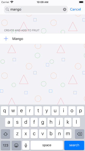
in search mode, the first two sections only display matching items in the relevant category, and the last section offers a “Create and Add Item” button automatically set to the search string
|
| Add, remove and create sub items |
Adding or removing an item from a list of sub-items does not destroy the item itself - this is done by tapping the bin icon in the top left of the item edit screen, and requires confirmation as this is a destructive operation. A deleted item will be removed from all sub-item lists in which it appears.
Simplify!
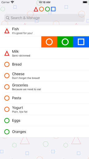
Updating the priority of an item is best done in place while browsing the list, by swiping left or right.
|
| Update priority with a swipe |
The pretty(?) but redundant and space-filling custom control featured in the first version’s item view makes way for the sub-item list in this new version.
Summary
This version introduces a new feature, some simplification. Since the app design relies so much on finding and using the search, the main question remains whether those features are easily discoverable by a first time user. As for the next steps, SwiftUI enters the scene and everything is up for rethinking.
